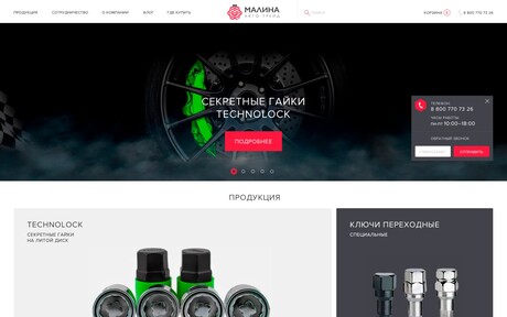
Full redesign of a narrow segmented online store for the wholesale of secret nuts and keys to them.
The logo
The customer wanted the new logo to reflect the business at a glance. To create it, a cross section of the nut was chosen, forming the letter "M" — the first letter in the Russian name of the company. And it is made in a bright and memorable crimson color in the shape of the berry itself. Сompletes the composition the "tail" of the screw.
The website
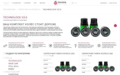
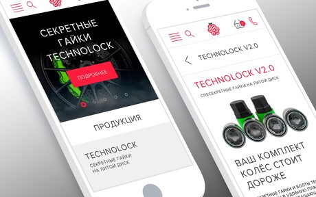
The client's wishes are minimalistic, gray metallic colors, adaptability for all devices, a convenient filter in the catalog.
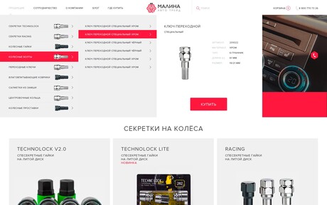
Special attention to the elaboration of the main menu, which was supposed to bring the visitor to the desired position without extra clicks and even allowed to make a quick purchase.
In the design, the same crimson color was used as an accent, and the hexagon became a full-fledged element of the corporate identity.
The main thing when working with the design of the pages was minimalism, contrast, and readability (for prints) and attention to detail from product images to footer icons.
