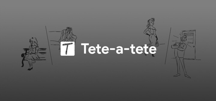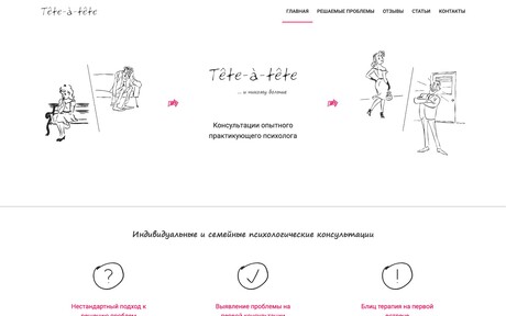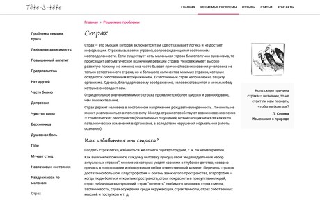
The Tete-a-tete is a website of a private psychologist. The concept, design, and development was completely carried out by specialists of 4D design.
The initial requirement was to make a resource unlike other sites in this field, get away from academicism, make the resource intuitive and understandable.
So there was a light and elegant design, with handwritten fonts and pencil illustrations.
In 2017 it was decided to update the design, add some space, remove redundant elements and thereby focus the user's attention on main information.
For this task, the Material Design concept from Google was ideally suited. The light design blended seamlessly into the concept, and the style of illustrations made it possible to convert them into a vector format, thereby reducing the page size.

