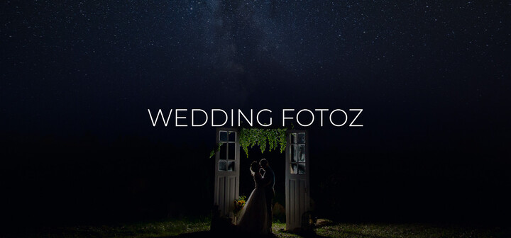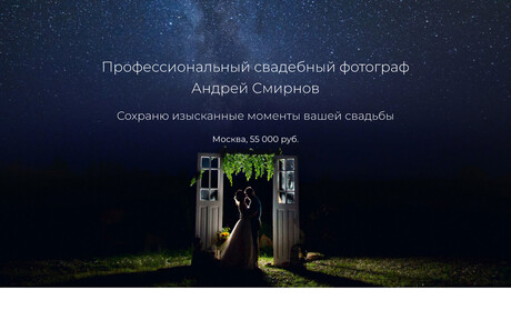
Andrey Smirnov, our friend and photography partner, was asked to develop a landing page to promote his wedding photography and video services. The organization of photography at events such as weddings always requires great responsibility and professionalism, so the site should also emphasize the high level of the photographer, and at the same time be simple and understandable.
The format and strategy for presenting information were developed jointly with Andrey. We have simplified and reduced the amount of text and wording as much as possible, leaving only the basic information and shifting the essence to the images themselves, which are the best demonstration of the quality of service.
The design was also developed according to Andrey's wishes. We analyzed the potential audience, devices, the specifics of choosing a wedding photographer, and suggested using minimalism, thin lines, and a large amount of free space. We used the Material Base theme that we developed as a base theme, which was great for this project and allowed us to focus on the details without wasting time on standard design elements. For the photo and reviews sliders, the Slick module was used, which allows us to implement "carousels" of any complexity. And since the page displays a fairly large number of photos, all the best image optimization practices were applied: responsive images, WebP format, and lazy loading.
Despite the fact that the project is not big, choosing Drupal allowed us to use ready-made modules and our own developments from other projects. The administrative interface is in no way inferior in flexibility and functionality to multi-page sites. Also, Drupal will allow you to add new features or sections of the site, if necessary, in the future, without a complete rebuilding.
Main features of the project
- Simple and lightweight design.
- Image optimization, WebP usage, responsive images, lazy loading.
- A complete content management system.
- Fully adaptive site for mobile devices.

